How we built our multi-platform design system at Booking.com
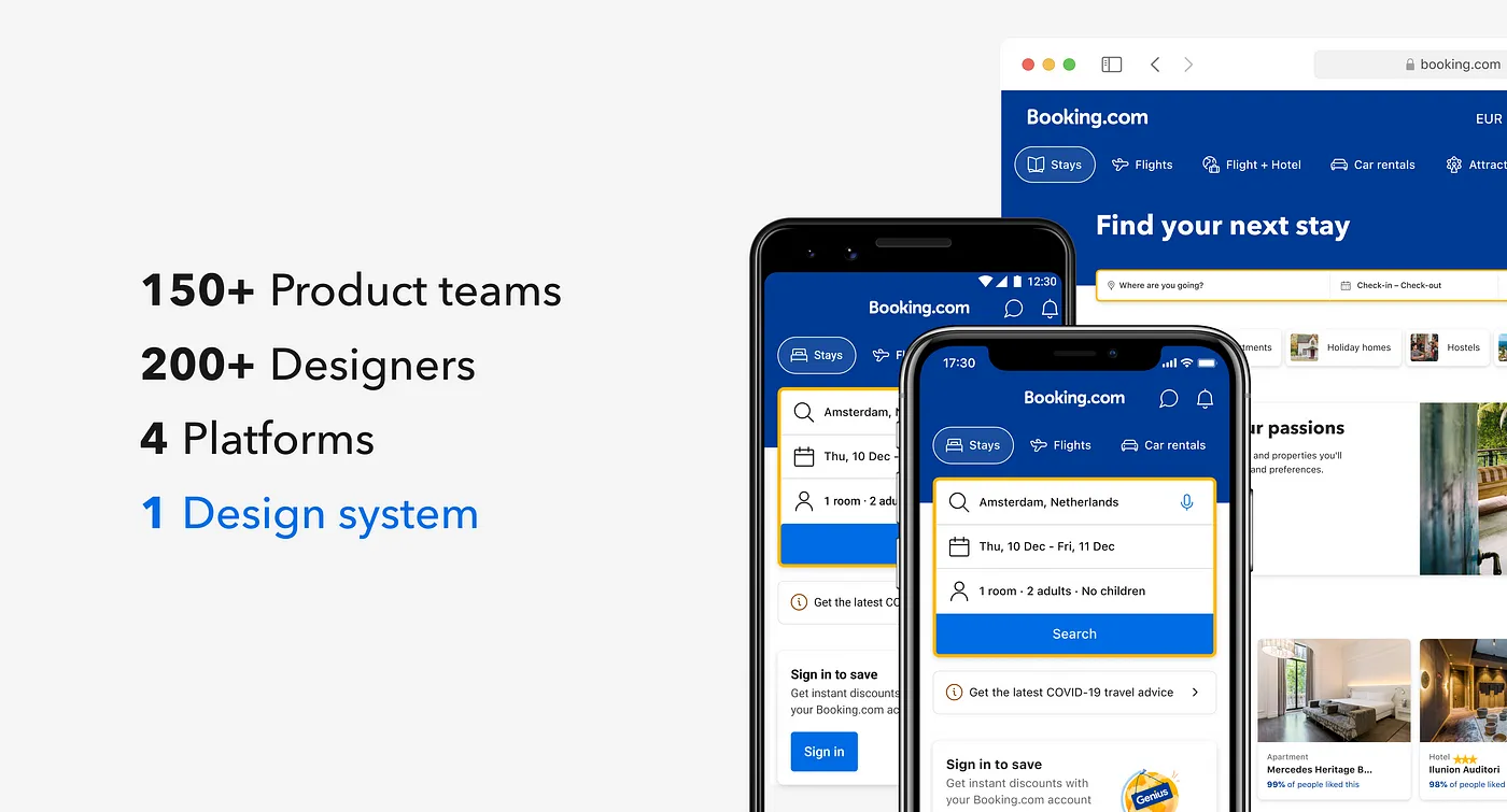
Building a design system that works is a challenge at any scale. Building a design system for 150+ product teams, used by 200+ designers and 800+ developers, and serving 4 different platforms? That’s a challenge requiring lots of special considerations.
When building a design system for such a large scale, many questions come to mind:
- How can we make it strong and scalable to multiple themes and brands?
- How can we maintain consistency of our components across multiple platforms?
- How can we ensure the product experience is cohesive and coherent, on any platform?
In this article, we dig deep into the setup of our multi-platform design system at Booking.com, and how we maintain it through a rigorous development process.
A bit about the team
At Booking.com, our mission is to make it easier for everyone to experience the world. For the design system team, that means:
Make it easier for our designers and developers to do their best work.
The design system itself is key to achieving this. Our team provides guidelines, component libraries, technical documentation, services, tools and education — all part of our robust design system — to enable product teams across the company to build high-quality products more efficiently.
Foundations as a source of truth
We’ve got a lot going on at Booking.com. We have hundreds of designers and developers working together on a variety of products across multiple platforms. This makes achieving a cohesive experience particularly challenging. A strong, scalable foundation is imperative.
Design Language
As a result of more than 25 years of experimentation, risk taking and growth, our product has evolved dramatically, and in many cases, organically. We harnessed that evolution — and paired it with a strategic vision — into what we call Design Language. It’s the foundation for both our brand standards and design system.

Design Language includes guidelines on usage of colour, typography, layout, iconography, photography, illustrations, and voice and tone.
The idea behind it all: no matter if you are searching for your next stay through our app, checking your car rental confirmation email, or browsing through one of our Instagram stories , it feels universally relatable, but distinctly Booking.com.
How, then, do you embed a design language into a large product with such a rich history? By creating a shared foundational layer across design and code for styles and assets, with:
Design tokens
Design tokens are used for color, typography, shadow, border-radius, spacing and grid. These are building pieces to help everything we design feel part of the same family.

Functional tokens communicate a specific semantic context. Colors have semantic groups like action, constructive, destructive, etc. But they also belong to specific functional groups like foreground, background, border, etc.
Design tokens allow us to support multiple themes, automatic dark mode, and are adjustable behind the scenes without any manual changes by product teams or annoying breaking changes.
The Design API
We packed all these styles into a single library to make them accessible to all designers. And since we support dark mode, we have another library that consists entirely of dark mode tokens. Three of our branded themes currently include dark mode assets, and we plan to add more in the future.

All of this equals six libraries with more than 600 styles. Maintaining this massive system manually is challenging. So together with our developers, we created one source of truth for all our themes, modes and tokens: the Design API.
The Design API stores foundational data, versions all changes, and converts platform-agnostic values into platform-specific tokens for iOS, Android, Vue, React and Figma.

To automatically pull data from the Design API to Figma, we built an internal plugin. It safely pulls all style data (including metadata with description) from our Design API. It saves us hours of manual work, and prevents many bugs and visual inconsistencies. And we can be sure all the time that it’s perfectly aligned with code.
Themer plugin
From there, we made a version of the plugin for all designers at Booking.com to work with themes and modes:
- Designers can toggle dark mode on a theme level
- Platform selection supports different system fonts (SF Pro for iOS, and Roboto for Android)
- Additional border radius theming, since Figma does not yet support border radius as a native design token

The plugin was inspired by the Themer plugin by Tom. With this API structure and tooling, designers are able to use only one style library and one component library for all products and themes, and for all supported platforms.
Asset Service
Just like design tokens, we also have shared assets, such as icons and illustrations, that need to be consistent across platforms.
Historically, our icons were used differently across platforms and had inconsistent styles and formats: icon-fonts, inline SVGs, PDFs, sprites — you name it, we had everything.

Just like the Design API, we worked with our developers to create one source of truth for all our assets — the Asset Service. It stores every icon in a single place, versions changes, and is used by all supported platforms — including Figma! And just like with tokens, we built a plugin that pulls all icons from the Asset Service to create and update our library. Cohesion at its best!
Multi-platform development: how we do it
With the foundations in place, we can now tackle how to maintain the system. In particular, how can our team keep components aligned across platforms, while constantly making changes? The short answer: build a process.
Historically, the design system was built on contributions from the community. As we were building early components for the design system, we used libraries and components that were already developed by each platform community, without syncing with each other. That led to misalignments between platforms.
We knew we had to create a process where designers and developers are working together, and in parallel. It’s easy for designers and developers to disconnect and work in silos, as the area of focus is quite different. But the key is to bridge that gap in order to create cross-platform alignment. Whenever we start working on a feature, whether that’s a new component, an update on a component, we follow this defined process:
- Design assessment 💡
- Handoff 📙
- Tech assessment 🔎
- Kickoff 🤝
- Implement 💻🤖📱
- Design & accessibility review ✅
- Release & share 📣

Let’s go through it step by step.
1. Design assessment 💡
The first part of the process is all about assessment before starting the work. This step is led by designers.
A. Assess the requirements
Most of the time, we are exploring changes that support product teams’ objectives and needs. We start by asking product designers to form a proposal detailing their requirements: problem statement, why the current situation doesn’t work, suggested solution, product use cases, etc.

B. Audit what’s there
After assessing the request, we audit the current state of the component on all platforms, and we highlight whether they have this change, something similar to it, and any other misalignments that we need to account for.
Here, we work with the developers to better understand how the component is currently implemented.

If we see another misalignment during the audit (for example in this case, the icon is supported everywhere except on web), we discuss and agree if we park it for later, or do the adjustment in the same effort
C. Design specs
Designers prepare the change required as a proposal. We define all the specs here: the anatomy, the variants, as well as component behaviors when relevant.

We work with the product designers and stakeholder teams to get feedback on the changes we are making to gather use cases and product insights.
At this stage, we also consult with Booking.com’s accessibility team. We work directly with them to review the accessibility requirements of the proposal, such as contrast ratios and aria labels for assistive technologies.
2. Handoff 📙
We’re now ready to share the change and its requirements with our developers and give them time to take a look at it and add their questions or comments.
We then meet and we thoroughly discuss the change, the anatomy and the detailed specs of the component. Together we discuss all the different possible variants and some product examples.
3. Tech assessment 🔎
After the developers have everything they need, they lead the tech assessment.
A. Discuss edge cases
Together we discuss and get consensus on the designs and behaviors depending on capabilities of each platform. We also resolve ambiguities or edge cases that require further investigation with our developers.

Sometimes we have to go back in a cycle to reiterate based on the technical requirements.
B. Review component properties ✨
During the tech assessment, the developers review the component properties. A component property is an attribute that represents a component feature that can be configured by product teams. Just like we store foundation tokens in our API, we also store component properties.

What’s nice about component properties is that they are platform-agnostic, meaning that they share the same properties even though they may look different.

Components can look quite different between iOS and Android, as we try to use native app design standards, but they still share the same exact properties in code. This is what makes properties so powerful. It is the one source of truth for every component, and it’s the key to multi-platform development.

After the properties are set, an assigned developer creates a merge request with any suggested changes. This sometimes results in a breaking change of which we announce to the developer community on our channels.
4. Kickoff 🤝
Now, we hold a kickoff meeting to start implementation. Designers and developers review the decisions we made, then commit to the changes and merge the properties request.

We set timelines for implementation and release days. Our goal is to do each implementation in parallel to keep the components aligned across platforms.
5. Implementation 💻🤖📱
Now that everyone is aligned, we can start the implementation on all platforms.
A. Develop
The developers execute the changes according to the new specs and requirements. We have our own internal platform to store the components, as well as the configurable properties.

B. Document
During implementation, the developers also update the tech documentation with the changes that we made.

Our tech documentation includes things like: composition, best practices, accessibility requirements, and an explanation of the different properties.
C. Sync with Figma component
Meanwhile, the designers create a branch in the main design system library and make the changes in that branch.

This is where we sync the Figma properties and variants with the properties that we defined earlier in the process.
D. Update design guidelines
The designers also review the design guidelines of the component. In our design guidelines we show the configurable properties, the behaviors, as well as dos and donts for designers.

6. Design and accessibility review ✅
After the implementation is done, the designers conduct a design review. We use the component playground apps for each platform to test the implemented component.

We go through the different specs and behaviors across all platforms, and we iterate accordingly.
7. Release & share 📣
Once it’s ready, a new library version is published on each platform with a release changelog. In Figma, we do regular weekly releases of the component library, to better manage the updates.

When a breaking change in the Figma component is expected, we highlight it in the changelog for better predictability.
This multi-platform development process was built and refined by the design system team over time — It didn’t just work from day one. To make it work for our team, and for the designers, developers and UXers who rely on the system, we constantly iterate and improve.
- Stronger design system: The API setup, design tokens and asset service are the foundation for our design system, and the reason we can scale to multiple themes and brands.
- Maintained consistency: Our defined process where developers are included from the start allows us to maintain consistency of our components across multiple platforms.
- Coherent experiences: This consistency allows product teams to build a product experience that is coherent, regardless of which platform it’s being accessed from.
So, the next time you build, or improve, a design system spanning more than one platform, think about how you might apply some of these principles to your own work.
Figma community resource 🎁
We documented this entire process for anyone in the Figma community! Check it out at this link. It even includes a checklist of each step of the process to use within your own teams.

Let us know what you think!
Would you like to hear more about a specific topic mentioned in the article? Let us know in the comments below!
